
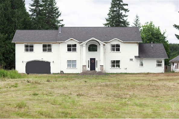
After convincing Will we should paint the house (ourselves!), I discovered the Personal Color Viewer Tool on the Benjamin Moore website. You can upload a picture of any surface you’d like to visualize in a different color. The end result is a bit sloppy, but it’s given me valuable insight as to what our home would look in white, grey and black, and the hundreds of other colors I tried out! Seriously, it’s addicting! I didn’t waste anytime time plugging in white for my siding because I’ve always wanted a white house, but wasn’t sure it’d look good on this house… what do you think, could I pull it off?

I wish I could add shutters to break up the white, but there isn’t enough room around most of the windows. If we were to choose white, I might add a few flower boxes to the two lower windows, but we’re about to add flower boxes to the adjacent barn. Is there such thing as too many flower boxes? I’d like to think not, especially since we’re florists! At the very least, adding the landscaping we’re hoping to get in this summer would surely soften up all that white.
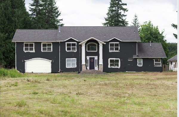
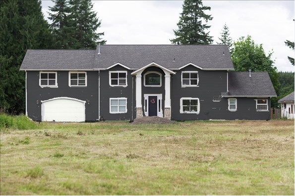
Before discovering this tool, I thought for certain I’d decide to play it “safe” and choose a light-to-mid-tone bluish grey color, but I don’t know that I’m feeling the grey on this house… to me, it cheapens the look.


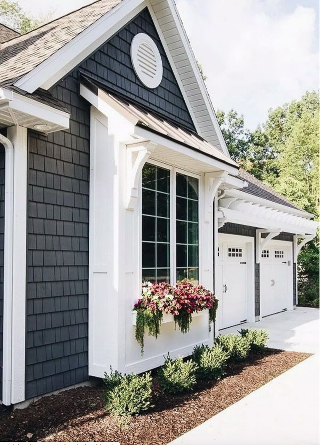
After experimenting with lots of colors, I’m quite tempted to go dark, which feels a little scary to me! I’m seriously considering Benjamin Moore’s Wrought Iron (the color we chose for the French doors throughout the interior of our house), but I don’t know, Black Ink is awfully pretty, too. Here’s a little inspiration photo for the dark look I love:
Which of these dark colors would you choose? Or should I go white??


Leave a reply to Sherri Cancel reply